THE BRIXTON POUND
Upgrading A Local Currency
The Brixton Pound was one of many local paper ‘currencies’ circulated in the UK. In reality, these were not rival currencies to the GBP, but re-branded Pounds with a one-to-one exchange rate. Though the popularity of such currencies is probably past, for a brief period, it inspired many designs, of which the Brixton Pound is the most recognized.
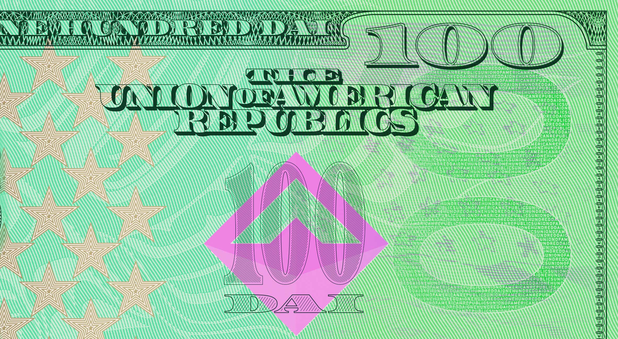
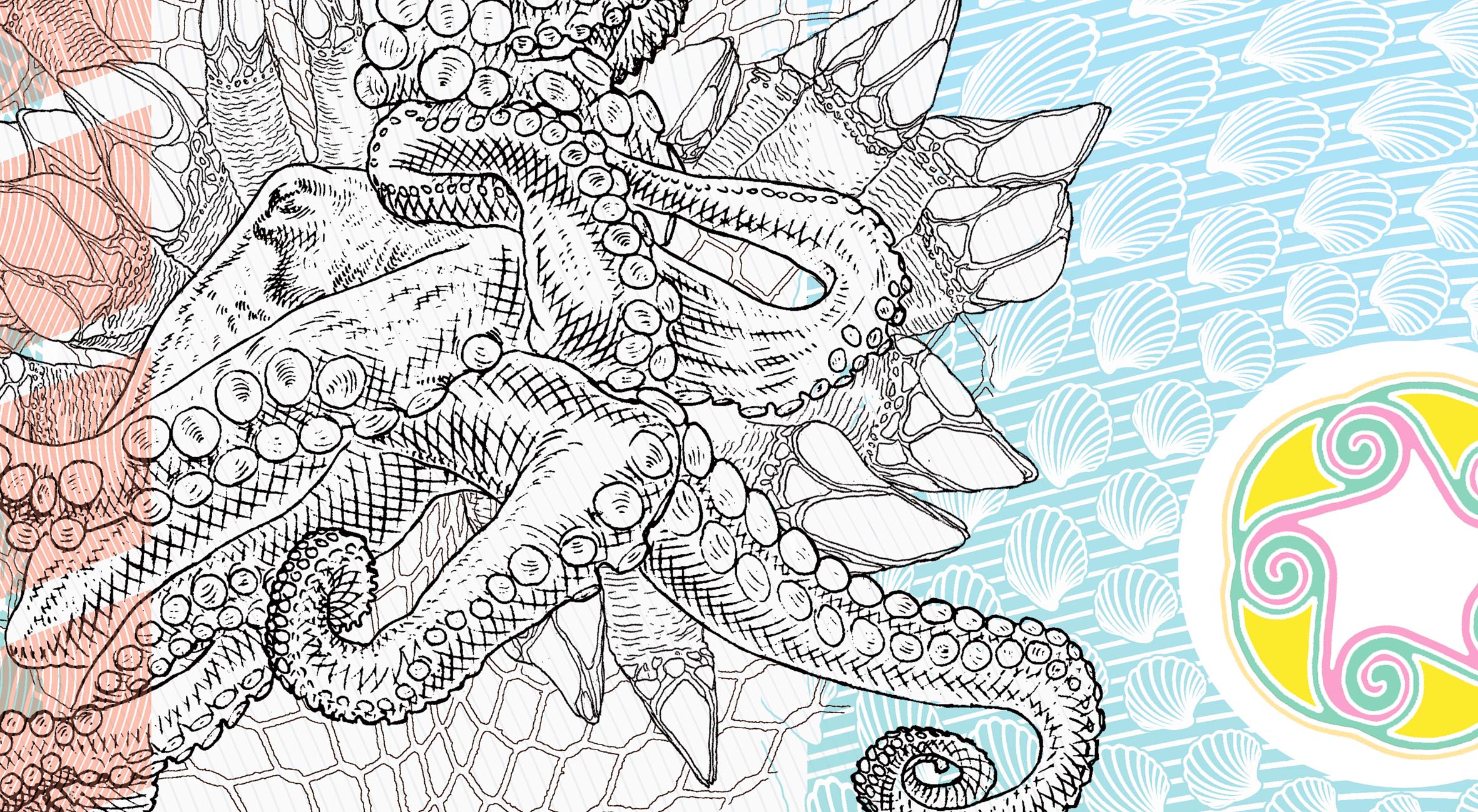
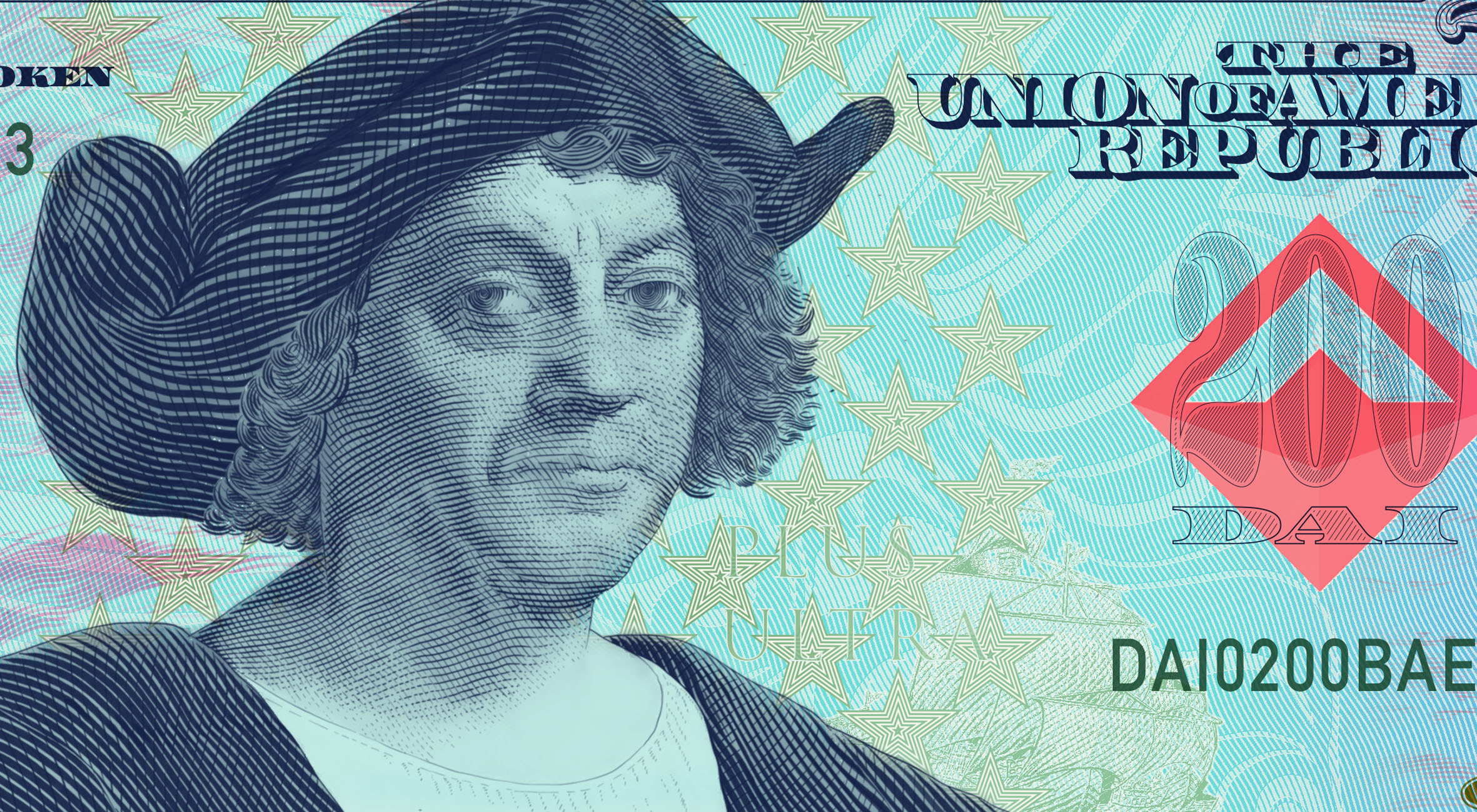
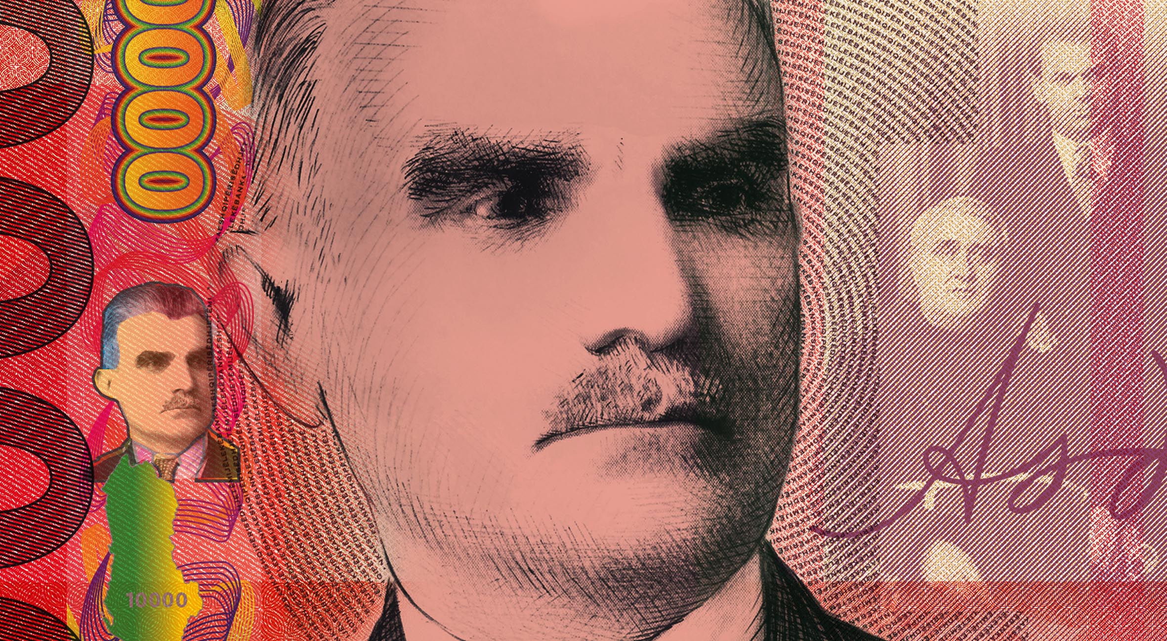
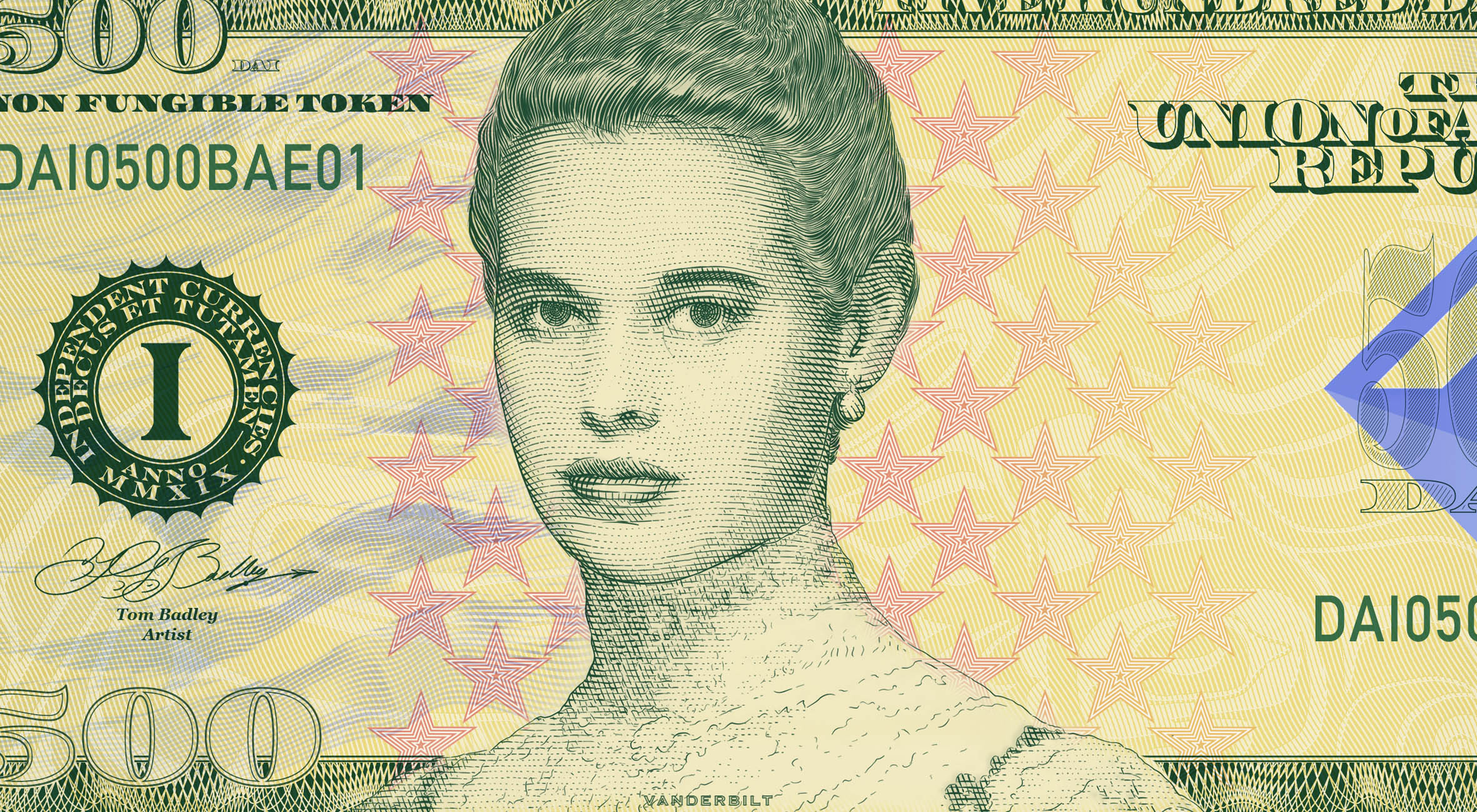
What would local and alternative currencies look like if they were designed and produced like real banknotes?

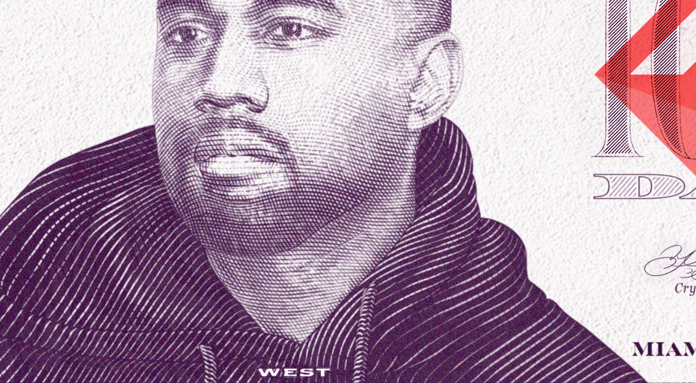
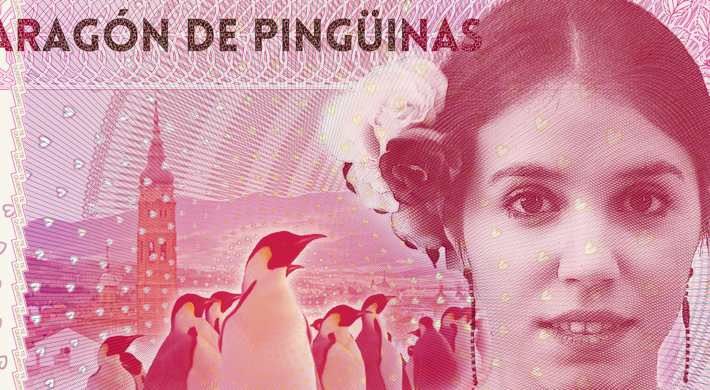
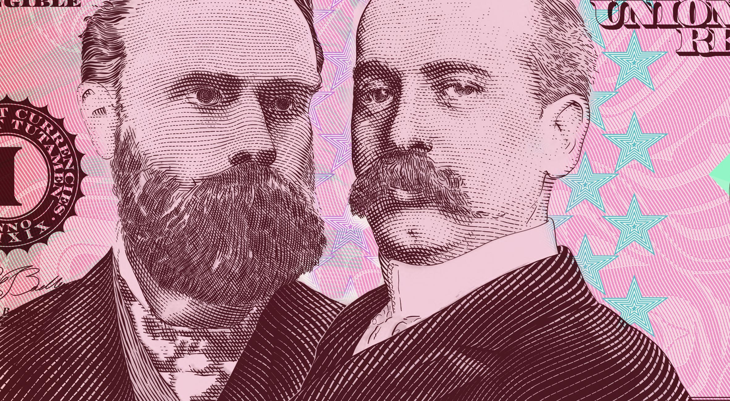
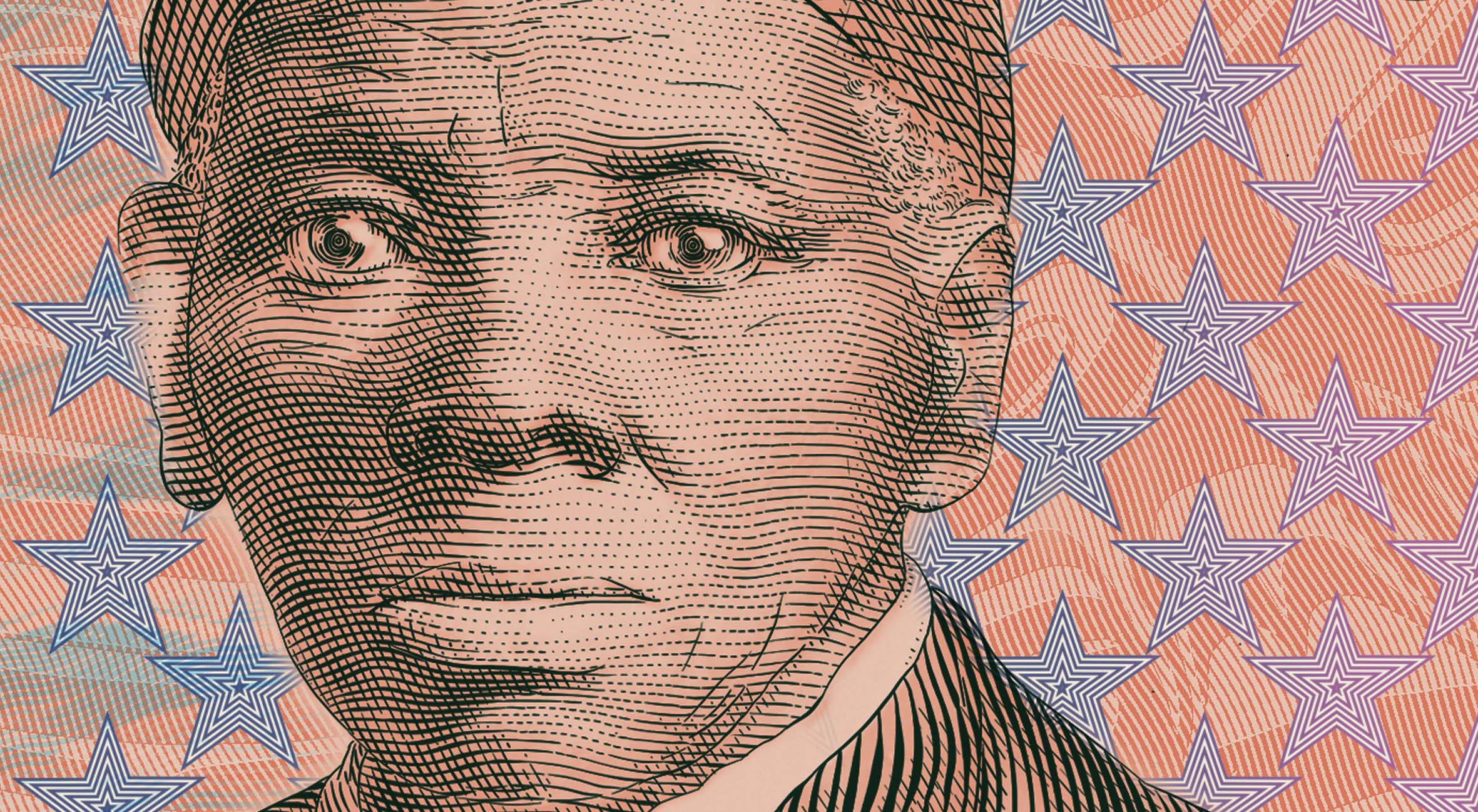
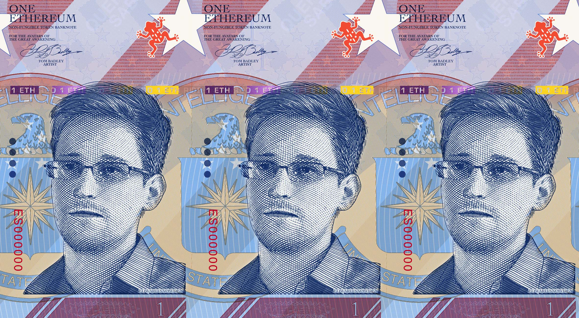
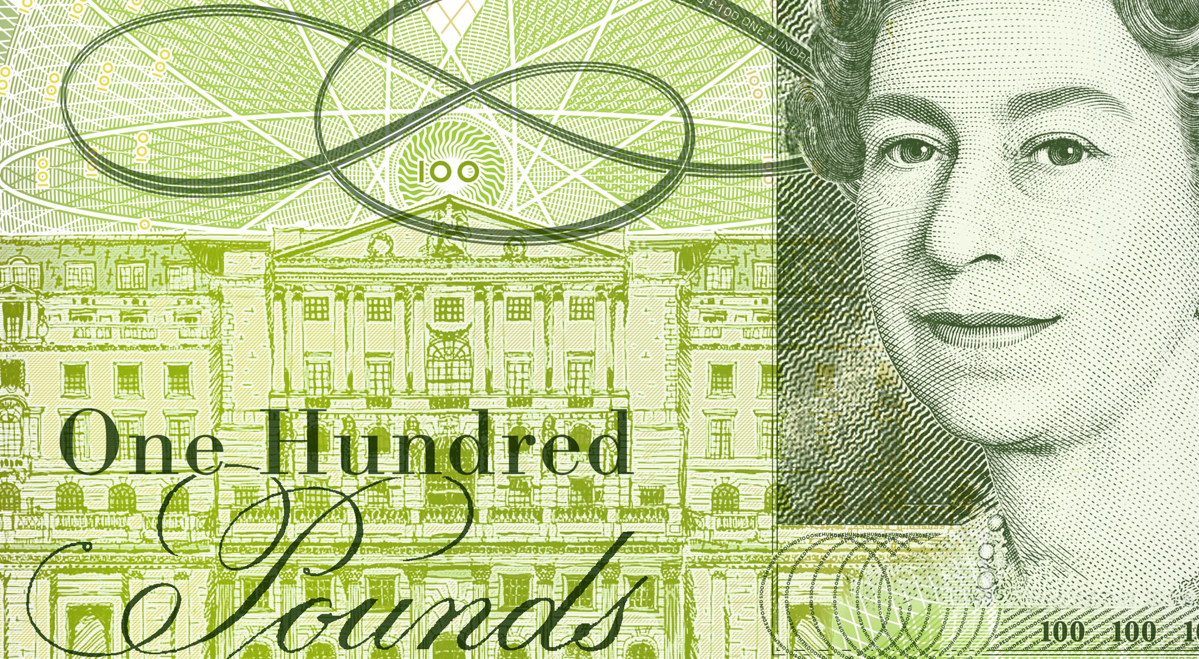
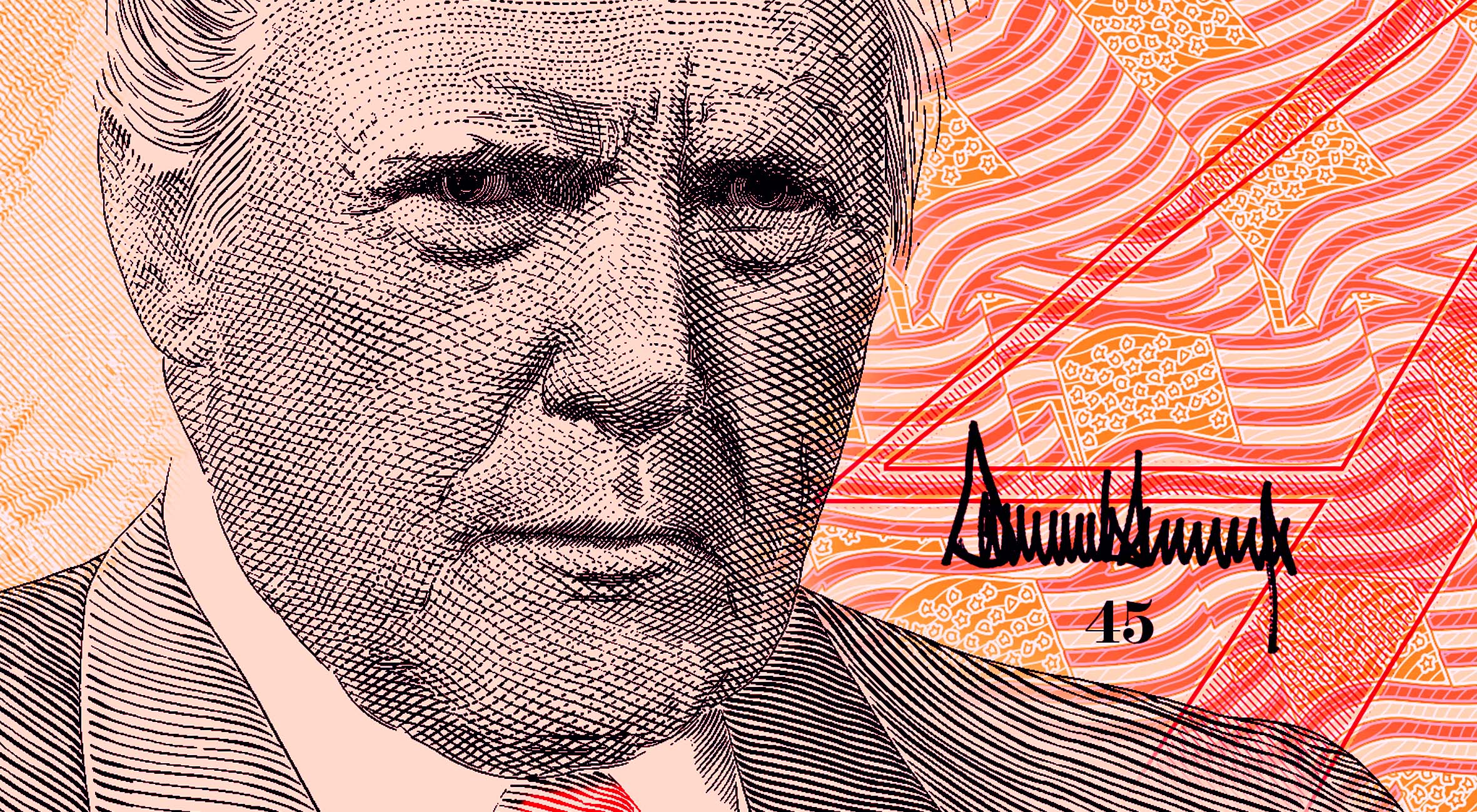
I ‘upgraded’ the original design of the UK’s best known alternative local currencies, the Brixton Pound. This design experiment came from talking to the designers of the Brixton Pound, who did everything they could to purposely reject the appearance of money, as an artistic and somewhat political statement – by rejecting the aesthetics of banknotes, the designers aimed to capture a spirit of revolution and ‘people power’. Thus, the Brixton Pound’s punk design is made of the bare minimum: numbers, portrait, text, and little else.
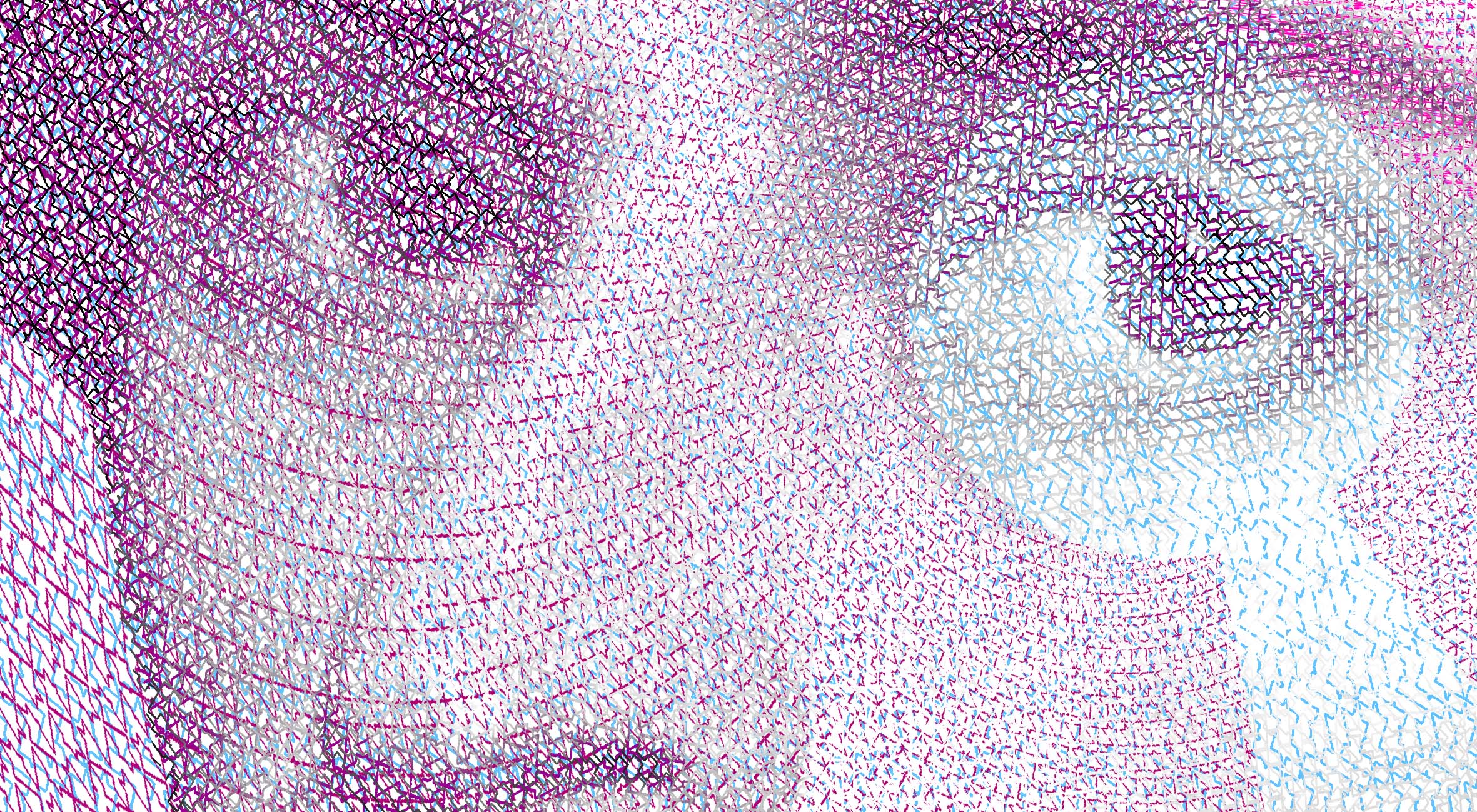
The aesthetics of banknotes have a vital function: they protect a currency from counterfeiting. None of the design features of a banknote are trivial, nor are they pompously decorative. The complexity of banknote design and hi-spec print processes allow the public to easily tell the difference between real and fake.
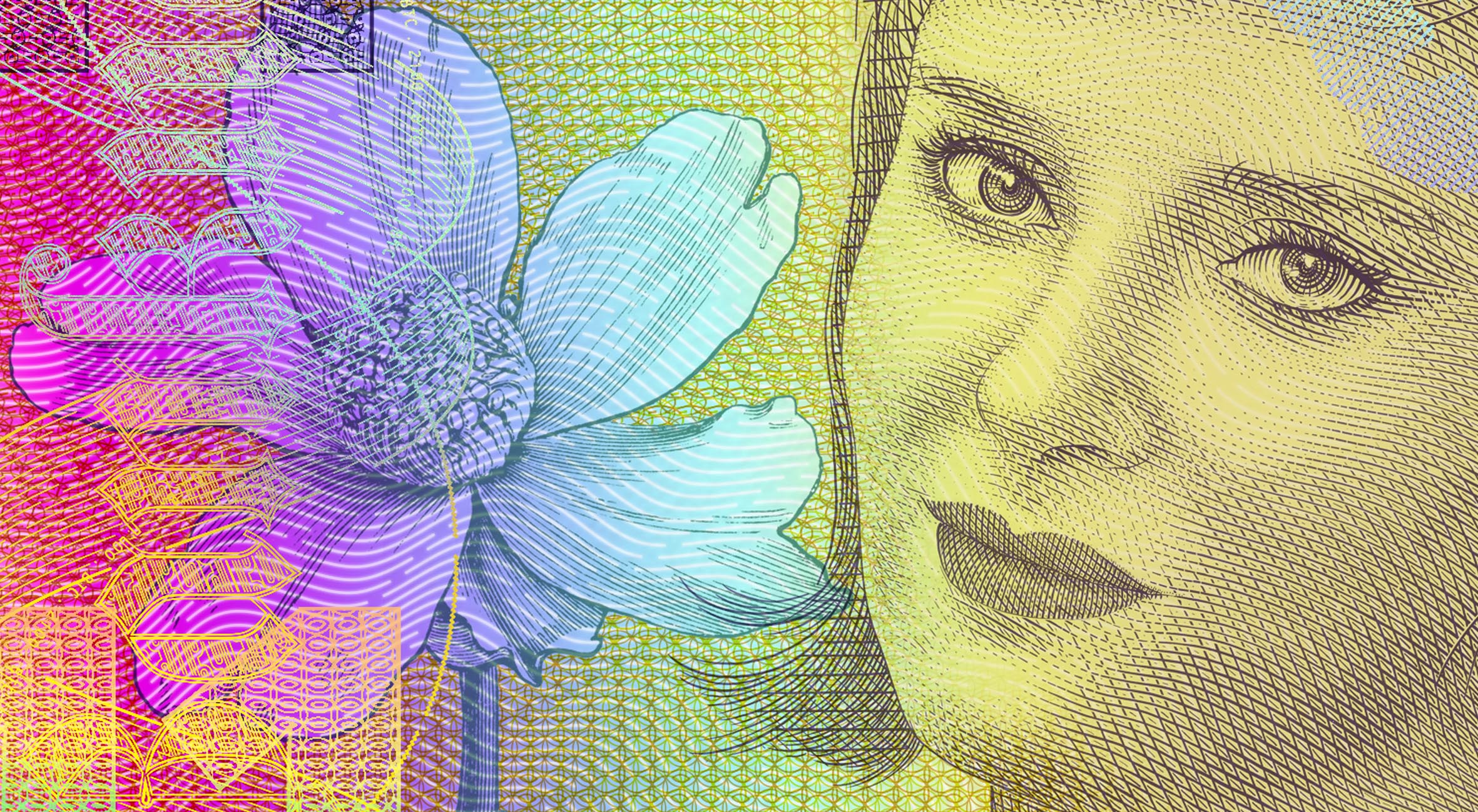
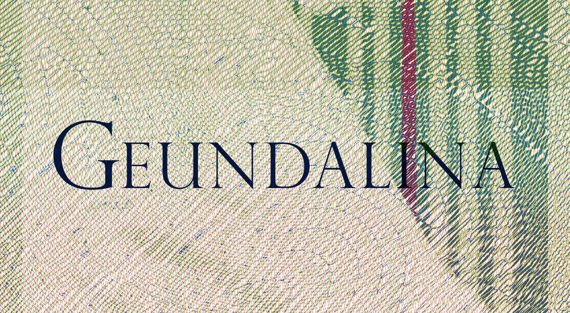
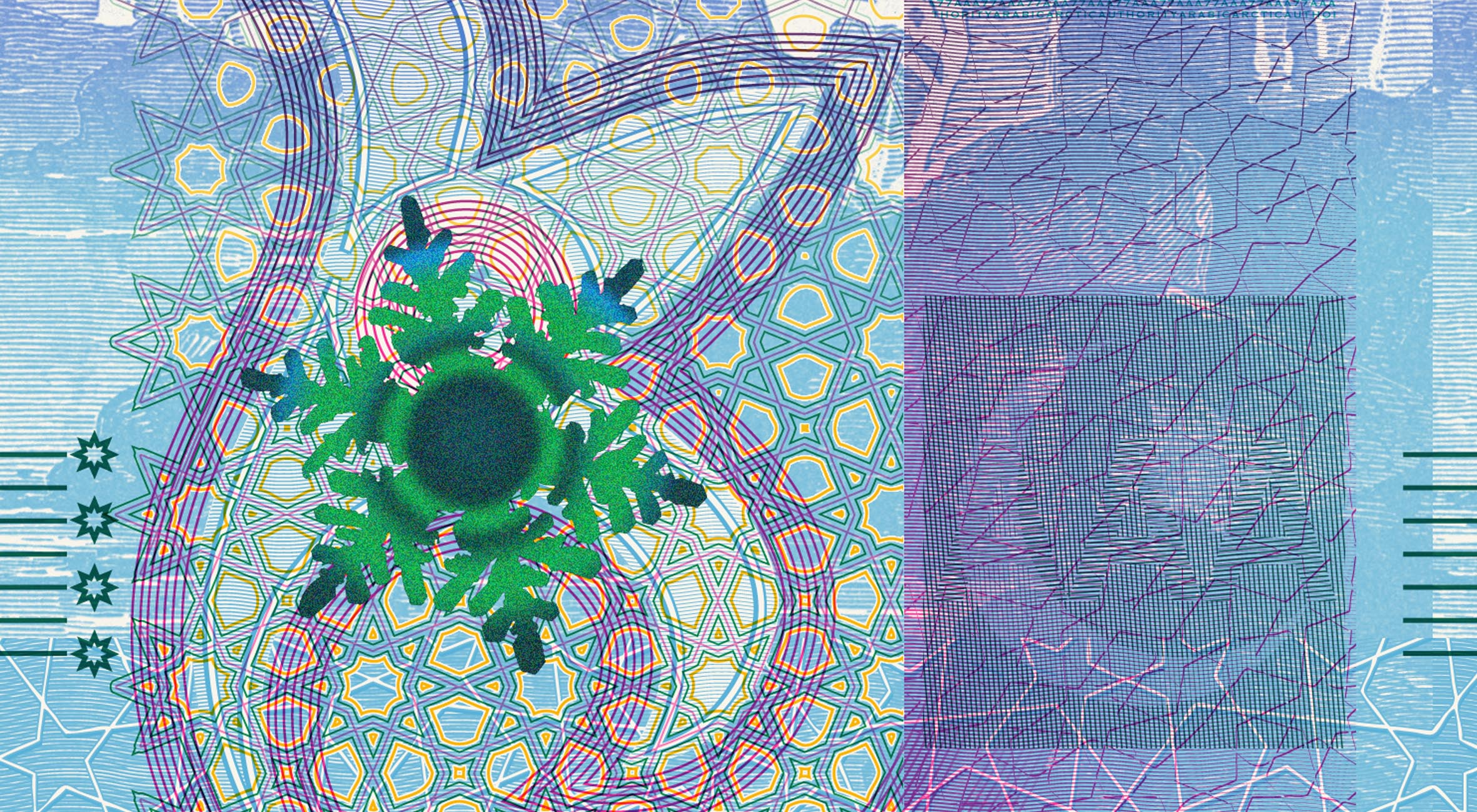
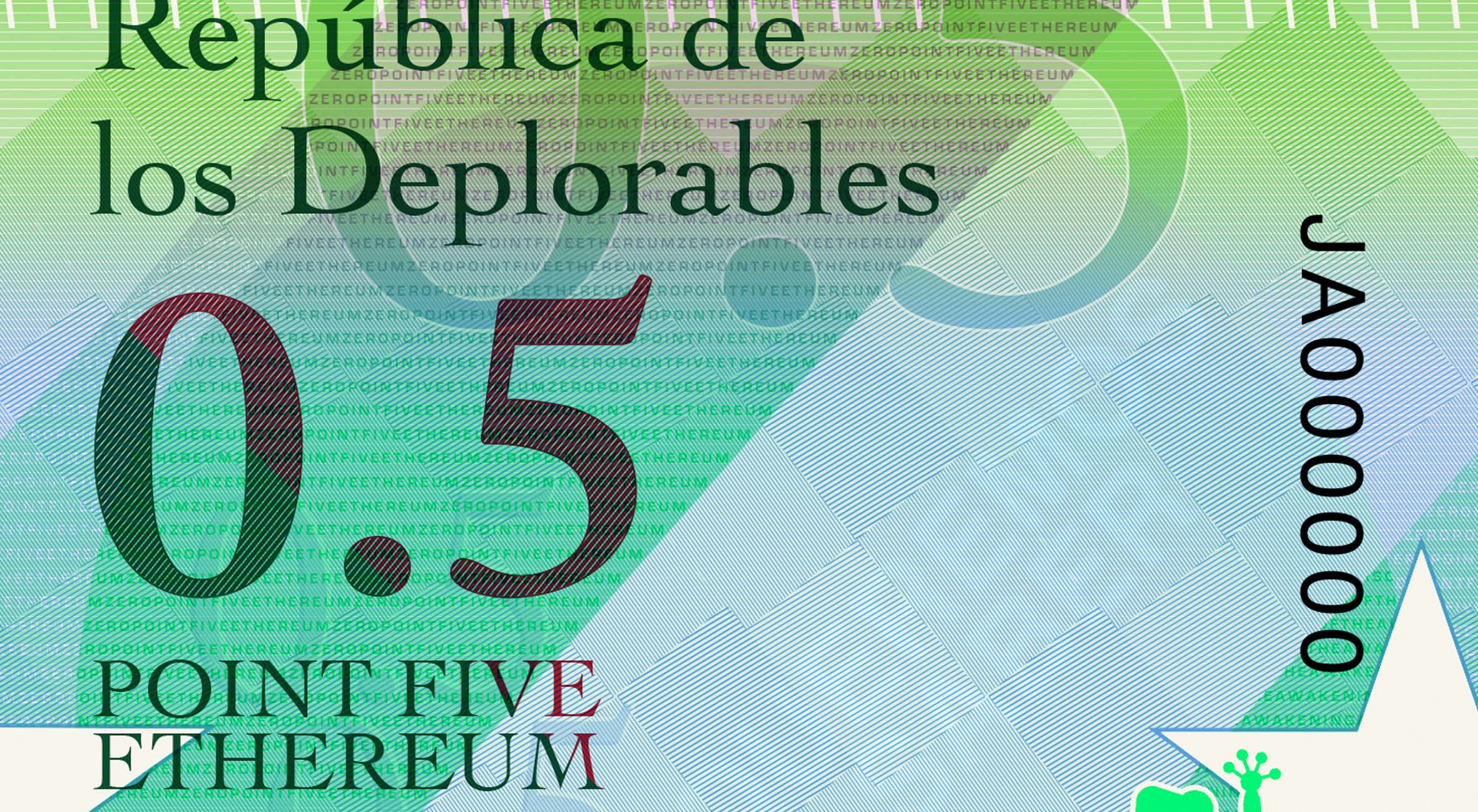
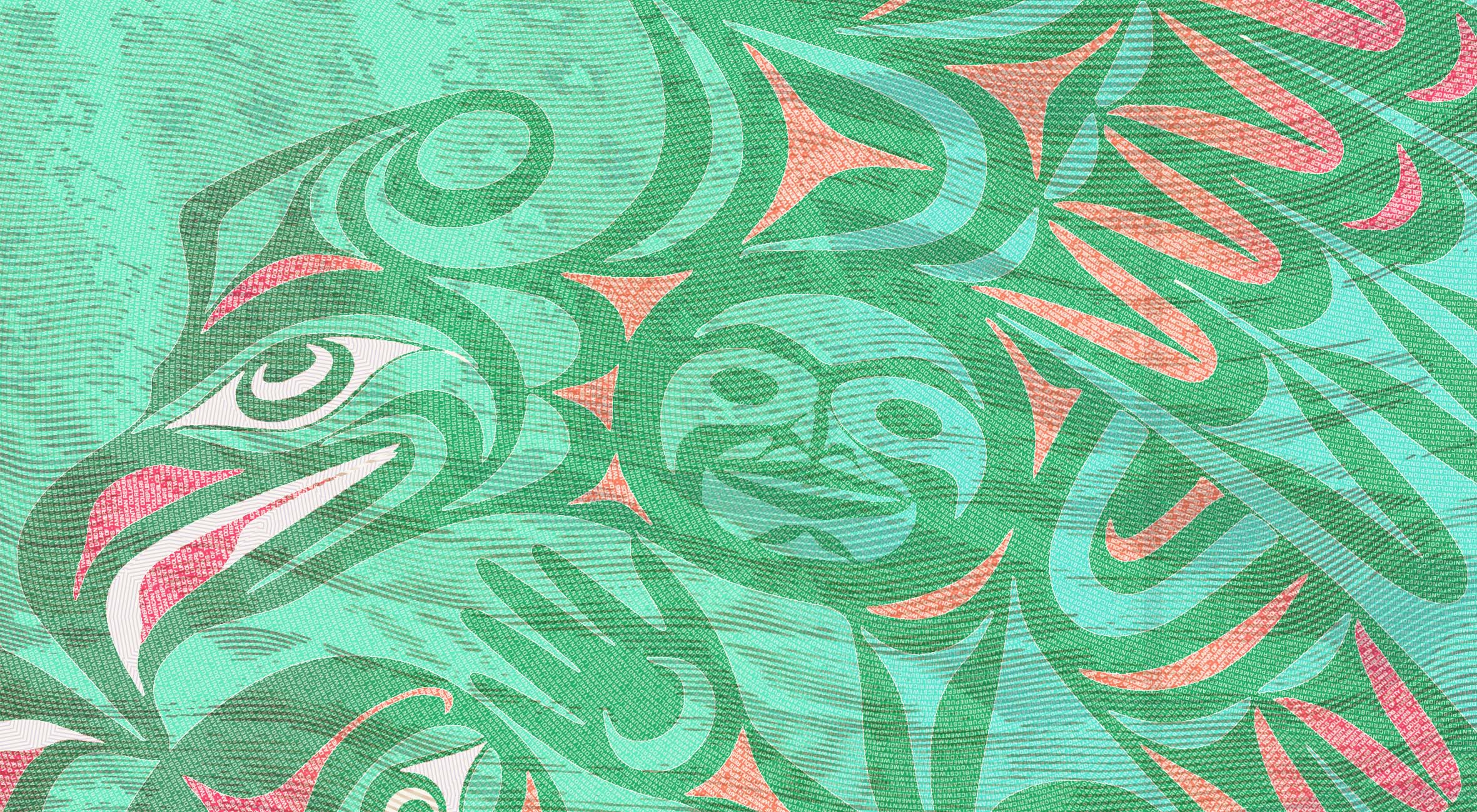
My ‘upgrade’ of the Brixton Pound features 3 colour intaglio, 4 colour rainbow offset, OVMI, security strip, microlettering, watermark, and continuous design.


